Choosing the right grout pen color for your tiles might seem like a small detail, but it’s one of those finishing touches that can completely transform the look of a room. Whether you’re dealing with slightly dingy bathroom grout, updating an older kitchen backsplash, or simply wanting a fresh, polished feel in your tiled spaces, grout pens offer a quick, cost-effective solution. The key, however, is selecting the right color so your tiles look refreshed rather than mismatched.
In this guide, we’ll walk you through everything you need to know about choosing the best grout pen color for your tiles. From understanding why grout shade matters, to matching it with your tile’s finish, to testing different options before committing—we’ll cover it all in a practical, DIY-friendly way.
By following these tips, you’ll feel confident in updating your grout lines without any stress or costly mistakes. Let’s dive in!
Why Grout Pen Color Choice Matters for Your Space
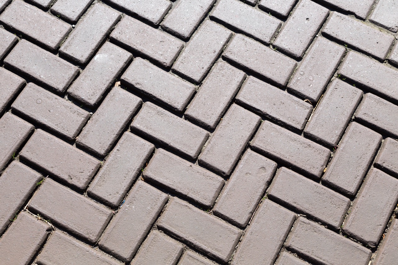
The color of your grout has a surprising impact on the overall look and feel of your tiled surface. Bright white grout lines, for instance, can make tiles appear fresh and clean, while darker grout tones can add depth, contrast, or even a dramatic edge. That’s why choosing the right grout pen color is not just a cosmetic decision—it’s about defining the mood and style of the room.
Think about grout lines as visual frames for your tiles. If the grout is too stark or mismatched, it will distract from your tiles instead of enhancing them. Conversely, a well-chosen grout pen color blends seamlessly, drawing attention to the beauty of the tile itself. This subtle but powerful design element can determine whether your flooring, backsplash, or shower looks cohesive or chaotic.
On a practical note, grout color also affects maintenance and perceived cleanliness. Lighter shades show dirt and discoloration faster, while darker tones can hide minor stains and wear over time. Understanding this balance between aesthetics and function will help you choose a grout pen color that not only looks good but also stays looking good with minimal upkeep.
Matching Grout Shades to Tile Style and Finish
The best starting point for choosing a grout pen color is looking at the tile itself. For classic white subway tiles, homeowners often stick with either a matching white grout for a seamless look or a bold dark gray for high contrast and modern flair. Earth-toned tiles, such as stone or terracotta, usually benefit from warm grout shades like beige or taupe that blend naturally with the tile’s texture.
Glossy tiles often work best with crisp grout lines, since reflections emphasize the borders between tiles. In these cases, choose a grout pen color that either matches closely for harmony or creates intentional contrast if you want that standout grid effect. On the other hand, matte-finish tiles with subtle variation often look best with a grout shade that complements rather than competes with the natural tones in the tile.
If your space already has a strong color palette in cabinetry, walls, or countertops, factor this into your grout pen choice. Sometimes a tone that echoes existing accents—like a gray grout pen matching stainless steel appliances—can pull the whole space together. Rather than thinking of grout in isolation, think of it as part of your overall design scheme.
Tips for Testing Colors Before Full Application
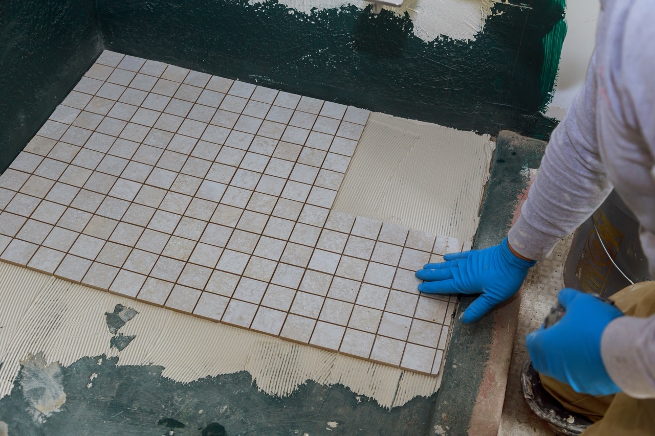
Before committing an entire surface to one grout pen color, it’s smart to test your options. Start by picking two or three shades you think could work. Many grout pen brands sell variety packs, which are ideal for sampling. Apply a short section of each shade—preferably in a less visible area like behind an appliance or corner of the shower—to see how they interact with your tiles.
Allow the test patches to dry fully before making a decision, since grout pen ink often looks slightly different when wet versus dry. Look at the samples under multiple lighting conditions—morning sunlight, evening indoor light, and even artificial light. You may be surprised at how different a shade can appear depending on the brightness and time of day.
Don’t forget to step back and view the entire wall or floor from a distance. What looks subtle up close may look more dramatic across a larger area. This quick testing step will save you the frustration of realizing a color is “off” after you’ve spent hours recoloring your grout lines.
Common Mistakes to Avoid When Selecting Grout Pens
One of the biggest mistakes homeowners make is choosing grout pen colors directly from online product photos without testing. Screens can distort shades, making grays look warmer or whites appear brighter than they really are in person. Always test before doing a full application to avoid disappointment.
Another common trip-up is ignoring how grout will age. A bright white pen may look stunning on the first day, but if your space is prone to moisture, food splatters, or heavy foot traffic, it may discolor quickly. If you’re redoing grout in a high-traffic kitchen floor, for example, a medium gray pen may be more practical than pure white.
Lastly, avoid trying to match grout pen color to tile exactly unless that’s your goal for a seamless look. Near-misses in matching can sometimes look more jarring than intentional contrast. Instead, ask yourself if you’d prefer your grout lines to blend invisibly or to stand out confidently—either direction works, but sitting “in-between” often feels accidental rather than stylish.
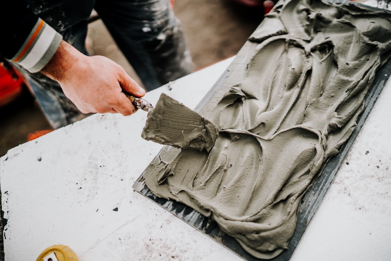
Updating your grout with a pen is one of the simplest DIY projects that can breathe new life into any tiled surface. By carefully selecting the right color, testing it in your space, and avoiding common pitfalls, you can create a polished, refreshed look without breaking the bank or hiring a professional.
Remember, grout pens are budget-friendly, reversible, and easy to apply—making them a perfect tool for both renters and homeowners alike. Whether you’re aiming for crisp and clean or bold and modern, your grout pen color choice has the power to tie the entire room together.
So next time you glance at those faded grout lines, don’t see them as a problem—see them as an opportunity. With the right color choice, you can transform your tiles and give your space a completely renewed feel in just a few simple steps.