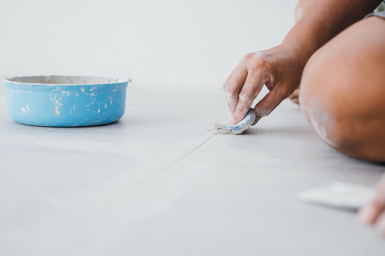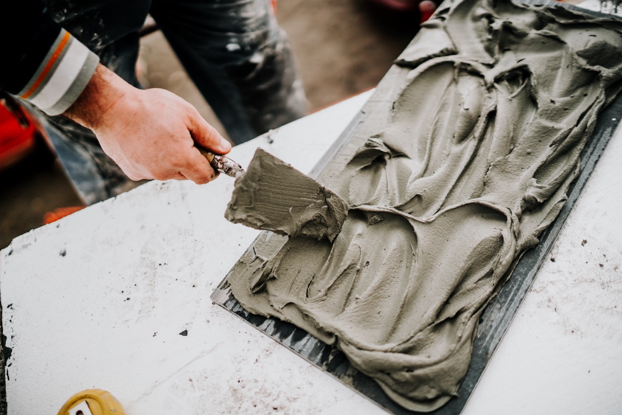
Refreshing the look of your tiles doesn’t always mean a full renovation. Sometimes, all it takes is the right grout pen to bring back their charm. These handy tools let you easily recolor or brighten up grout lines without the hassle of retiling. But with so many colors available, how do you know which one will best complement your tiles? Choosing the right grout pen color isn’t just about preference, it’s about creating harmony in your space and enhancing the overall look of your flooring, backsplash, or bathroom.
Factors to Consider Before Picking a Grout Pen
When deciding on the best grout pen color, the first step is to think about the tile’s existing shade. Darker tiles often pair well with darker grout colors, as this creates a flowing, seamless effect with fewer visual interruptions. On the other hand, lighter grout pens work beautifully for pale tiles, keeping the design fresh, airy, and cohesive. Keeping the tile’s tone in mind ensures that the grout color doesn’t clash or create an unintended contrast.
The second factor to weigh is the style you’re aiming for in your space. For example, if you want a bold, contemporary look, contrasting grout might highlight each tile’s outline and create a grid effect. In contrast, if you want the focus to remain on the tiles themselves—such as luxurious marble or patterned ceramic—then a grout pen color that blends in will allow the beauty of the tile to stand front and center. Think of grout as the supporting character—it can make a statement or stay subtle, depending on your design vision.
Finally, practicality should always come into play. Light-colored grout is well known for showing stains over time, especially in high-traffic areas like kitchens or bathroom floors. While a bright white grout pen may look striking against darker tiles, it will demand more frequent touch-ups to maintain its clean appearance. Darker grout colors, on the other hand, offer more forgiveness in daily use and will often look fresher for longer. Striking a balance between aesthetics and maintenance will help you choose a grout pen color that stands the test of time.
Matching Grout Pen Colors With Different Tile Styles
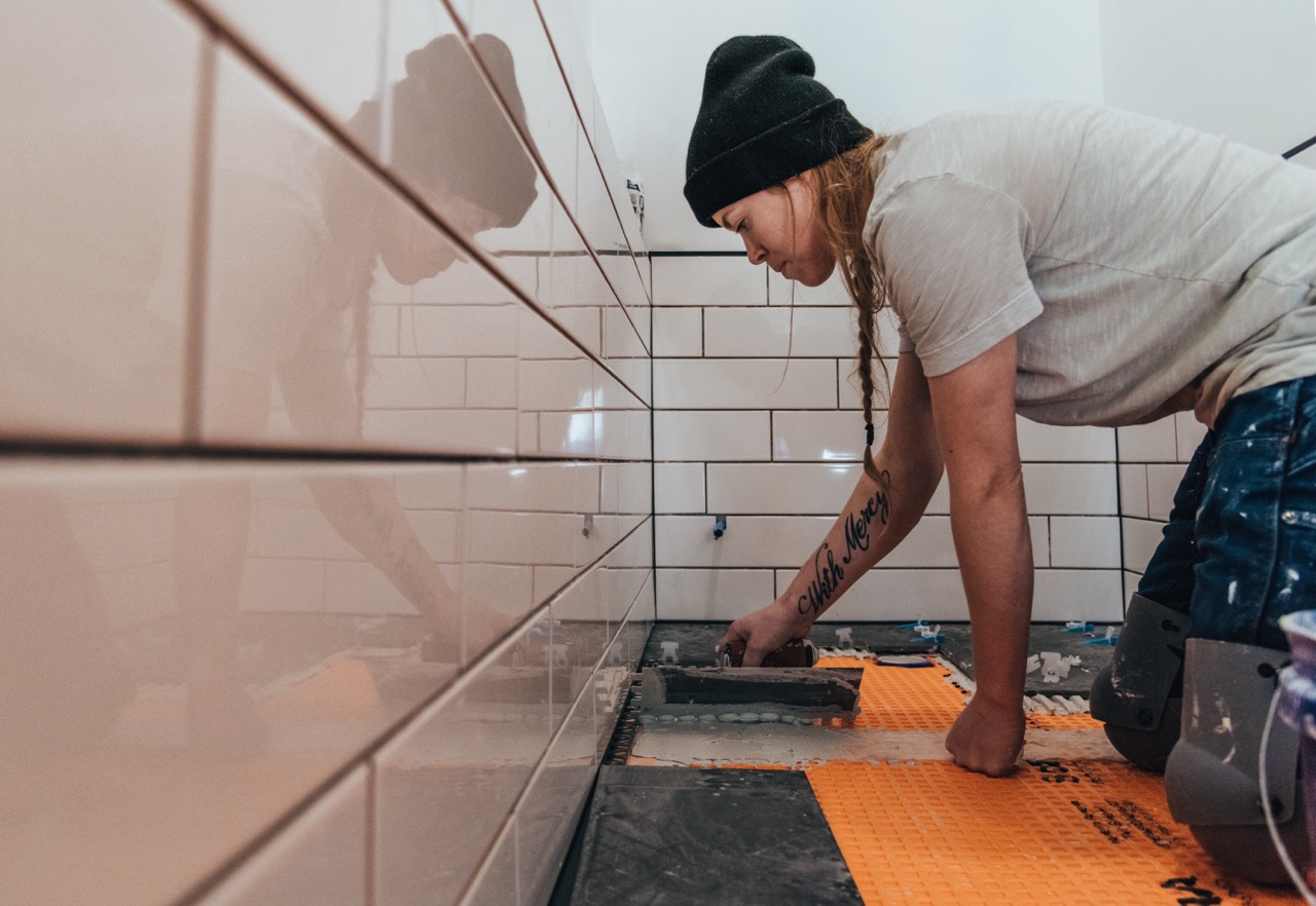
Tile style plays an essential role in coordinating grout colors, and the right pairing can make all the difference. For classic white subway tiles, a white or gray grout pen is a timeless choice, keeping the space polished and simple. But if you want to give these tiles a more industrial or modern vibe, try a darker grout pen color, which will emphasize the tile lines and create more visual structure. This works particularly well in kitchens with sleek finishes.
When working with patterned or decorative tiles, it’s usually best to let the tile design speak for itself. A neutral grout pen color, such as soft beige or light gray, helps anchor the patterns without overwhelming them. By allowing the shapes and motif of the tiles to shine, you avoid a busy look that could appear cluttered. Matching the grout color with the background tone of the tile is often a smart approach.
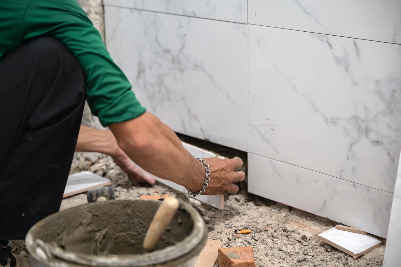
For natural stone tiles like slate, travertine, or marble, subtle grout shades help highlight the variations in the stone without creating too much contrast. A grout pen that mimics the stone’s undertone—such as warm gray, tan, or ivory—will produce a cohesive, elegant finish. The goal is to enhance the natural texture of the stone while keeping the transitions between tiles soft and seamless, blending design harmony with sophistication.
Choosing the right grout pen color for your tiles is more than a finishing touch—it’s a design decision that can redefine the atmosphere of a room. By considering factors like the tile shade, intended style, and ease of upkeep, you can find a grout pen color that balances both practicality and aesthetics. Taking time to align grout pen hues with different tile styles ensures that the result is cohesive, beautiful, and tailored to your taste. In the end, the best grout color is the one that not only enhances your tiles but also makes your entire space feel refreshed and complete.